Friday, February 26, 2021

Bridging Physics and Biology Teaching Through Modeling

In this blog, I often stress the value of toy models. I’m not the only one who feels this way. Anne-Marie Hoskinson and her colleagues suggest that modeling is an important tool for teaching at the interface of physics and biology (“Bridging Physics and Biology Teaching Through Modeling,” American Journal of Physics, Volume 82, Pages 434–441, 2014). They write
While biology and physics might appear quite distinct to students, as scientific disciplines they both rely on observations and measurements to explain or to make predictions about the natural world. As a shared scientific practice, modeling is fundamental to both biology and physics. Models in these two disciplines serve to explain phenomena of the natural world; they make predictions that drive hypothesis generation and data collection, or they explain the function of an entity. While each discipline may prioritize different types of representations (e.g., diagrams vs mathematical equations) for building and depicting their underlying models, these differences reflect merely alternative uses of a common modeling process. Building on this foundational link between the disciplines, we propose that teaching science courses with an overarching emphasis on scientific practices, particularly modeling, will help students achieve an integrated and coherent understanding that will allow them to drive discovery in the interdisciplinary sciences.
One of their examples is the cardiac cycle, which they compare and contrast with the thermodynamic Carnot cycle. The cardiac cycle is best described graphically, using a pressure-volume diagram. Russ Hobbie and I present a PV plot of the left ventricle in Figure 1.34 of Intermediate Physics for Medicine and Biology. Below, I modify this plot, trying to capture its essence while simplifying it for easier analysis. As is my wont, I present this toy model as a new homework problem.
Sec. 1.19

Problem 38 ½. Consider a toy model for the behavior of the heart’s left ventricle, as expressed in the pressure-volume diagram

(a) Which sections of the cycle (AB, BC, CD, DA) correspond to relaxation, contraction, ejection, and filling?

(b) Which points during the cycle (A, B, C, D) correspond to the aortic value opening, the aortic value closing, the mitral value opening, and the mitral valve closing?

(c) Plot the pressure versus time and the volume versus time (use a common horizontal time axis, but individual vertical pressure and volume axes).

(d) What is the systolic pressure (in mm Hg)?

(e) Calculate the stroke volume (in ml). 

(f) If the heart rate is 70 beats per minute, calculate the cardiac output (in m3 s–1).

(g) Calculate the work done per beat (in joules).

(h) If the heart rate is 70 beats per minute, calculate the average power output (in watts).

(i) Describe in words the four phases of the cardiac cycle.

(j) What are some limitations of this toy model?

The last two parts of the problem are crucial. Many students can analyze equations or plots, but have difficulty relating them to physical events and processes. Translation between words, pictures, and equations is an essential skill. 

All toy models are simplifications; one of their primary uses is to point the way toward more realistic—albeit more complex—descriptions. Many scientific papers contain a paragraph in the discussion section describing the approximations and assumptions underlying the research.

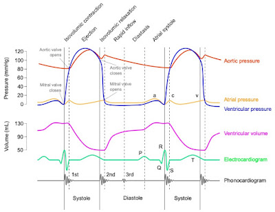
Below is a Wiggers diagram from Wikipedia, which illustrates just how complex cardiac physiology can be. Yet, our toy model captures many general features of the diagram.


A Wiggers diagram summarizing cardiac physiology.
Source: adh30 revised work by DanielChangMD who revised original work of DestinyQx;
Redrawn as SVG by xavax, CC BY-SA 4.0, via Wikimedia Commons

I’ll give Hoskinson and her coworkers the last word.

“We have provided a complementary view to transforming undergraduate science courses by illustrating how physics and biology are united in their underlying use of scientific models and by describing how this practice can be leveraged to bridge the teaching of physics and biology.”

The Wiggers diagram explained in three minutes!
https://www.youtube.com/watch?v=0sogXvxxV0E

Friday, February 19, 2021

Magnetic Coil Stimulation of Straight and Bent Amphibian and Mammalian Peripheral Nerve in Vitro: Locus of Excitation

In this blog, I like to highlight important journal articles. One of my favorites is “Magnetic Coil Stimulation of Straight and Bent Amphibian and Mammalian Peripheral Nerve in Vitro: Locus of Excitation” by Paul Maccabee and his colleagues (Journal of Physiology, Volume 460, Pages 201–219, 1993). This paper isn’t cited in Intermediate Physics for Medicine and Biology, but it should be. It’s related to Homework Problem 32 in Chapter 8, about magnetic stimulation of a peripheral nerve.

The best part of Maccabee’s article is the pictures. I reproduce three of them below, somewhat modified from the originals. 

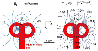
The electric field and its derivative produced by magnetic stimulation using a figure-of-eight coil. Based on an illustration in Maccabee et al. (1993).
Fig. 1. The electric field and its derivative produced by magnetic stimulation using a figure-of-eight coil. Based on an illustration in Maccabee et al. (1993).

The main topic of the paper was how an electric field induced in tissue during magnetic stimulation could excite a nerve. The first order of business was to map the induced electric field. Figure 1 shows the measured y-component of the electric field, Ey, and its derivative dEy/dy, in a plane below a figure-of-eight coil. The electric field was strongest under the center of the coil, while the derivative had a large positive peak about 2 cm from the center, with a large negative peak roughly 2 cm in the other direction. Maccabee et al. included the derivative of the electric field in their figure because cable theory predicted that if you placed a nerve below the coil parallel to the y axis, the nerve would be excited where −dEy/dy was largest. 

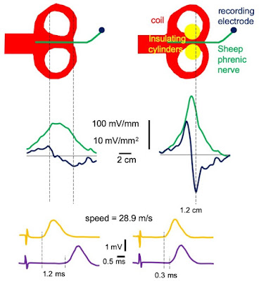
An experiment to show how the stimulus location changes with the stimulus polarity. Based on an illustration in Maccabee et al. (1993).
Fig. 2. An experiment to show how the stimulus location changes with the stimulus polarity. Based on an illustration in Maccabee et al. (1993).

The most important experiment is shown in Figure 2. The goal was to test the prediction that the nerve was excited where dEy/dy is maximum. The method was to simulate the nerve using one polarity and then the other, and determine if the location where the nerve is stimulated shifted by about 4 cm, as Figure 1 suggests.

A bullfrog sciatic nerve (green) was dissected out of the animal and placed in a bath containing saline (light blue). An electrode (dark blue dot) recorded the action potential as it reached the end of the nerve. A figure-of-eight coil (red) was placed under the bath. First Maccabee et al. stimulated with one polarity so the stimulation site was to the right of the coil center, relatively close to the recording electrode. The recorded signal (yellow) consisted of a large, brief stimulus artifact followed by an action potential that propagated down the nerve with a speed of 40.5 m/s. Then, they reversed the stimulus polarity. As we saw in Fig. 1, this shifted the location of excitation to another point to the left of the coil center. The recorded signal (purple) again consisted of a stimulus artifact followed by an action potential. The action potential, however, arrived 0.9 ms later because it started from the left side of the coil and therefore had to travel farther to reach the recording electrode. They could determine the distance between the stimulation sites by dividing the speed by the latency shift; (40.5 m/s)/(0.9 ms) = 4.5 cm. This was almost the same as the distance between the two peaks in the plot of dEy/dy in Figure 1. The cable theory prediction was confirmed. 

The effect of insulating obstacles on the site of magnetic stimulation. Based on an illustration in Maccabee et al. (1993).
Fig. 3. The effect of insulating obstacles on the site of magnetic stimulation. Based on an illustration in Maccabee et al. (1993).

In another experiment, Maccabee and his coworkers further tested the theory (Fig. 3). The electric field induced during magnetic stimulation was perturbed by an obstruction. They placed two insulating lucite cylinders (yellow) on either side of the nerve, which forced the induced current to pass through the narrow opening between them. This increased the strength of the electric field (green), and caused the negative and positive peaks of the derivative of the electric field (dark blue) to move closer together. Cable theory predicted that if the cylinders were not present the latency shift upon change in polarity would be relatively long, while with the cylinders the latency shift would be relatively short. The experiment found a long latency (1.2 ms) without the cylinders and a short latency (0.3 ms) with them, confirming the prediction. This behavior might be important when stimulating, say, the median nerve as it passes between two bones in the arm.

In addition, Maccabee examined nerves containing bends, which created “hot spots” where excitation preferentially occurred. They also examined polyphasic stimuli, which caused excitation at both the negative and positive peaks of dEy/dy nearly simultaneously. I won’t reproduce all their figures, but I recommend you download a copy of the paper and see them for yourself.

Why do I like this paper so much? For several reasons.

  • It’s an elegant example of how theory suggests an experiment, which once confirmed leads to additional predictions, resulting in even more experiments, and so on; a virtuous cycle
  • Their illustrations are informative and clear (although I do like the color in my versions). You should be able to get the main point of a scientific paper by merely looking through the figures, and you can do that with Maccabee et al.’s article.
  • In vitro experiments (nerve in a dish) are nice because they strip away all the confounding details of in vivo (nerve in an arm) experiments. You can manipulate the system (say, by adding a couple lucite cylinders) and determine how the nerve responds. Of course, some would say in vivo experiments are better because they include all the complexities of an actual arm. As you might guess, I prefer the simplicity and elegance of in vitro experiments. 
  • If you want a coil that stimulates a peripheral nerve below its center, as opposed to off to one side, you can use a four-leaf-coil.
  • Finally, I like this article because Peter Basser and I were the ones who made the theoretical prediction that magnetic stimulation should occur where dEy/dy, not Ey, is maximum (Roth and Basser, “Model of the Stimulation of a Nerve Fiber by Electromagnetic Induction,” IEEE Transactions on Biomedical Engineering, Volume 37, Pages 588-597, 1990). I always love to see my own predictions verified. 

I’ve lost track of my friend Paul Maccabee, but I can assure you that he did good work studying magnetic stimulation of nerves. His article is well worth reading.

Friday, February 12, 2021

A Mechanism for the Dip in the Strength-Interval Curve During Anodal Stimulation of Cardiac Tissue

Scientific articles aren’t published until they’ve undergone peer review. When a manuscript is submitted to a scientific journal, the editor asks several experts to read it and provide their recommendation. All my papers were reviewed and most were accepted and published, although usually after a revision. Today, I’ll tell you about one of my manuscripts that did not survive peer review. I’m glad it didn’t.

In the early 1990s, I was browsing in the library at the National Institutes of Health—where I worked—and stumbled upon an article by Egbert Dekker about the dip in the anodal strength-interval curve.

Dekker, E. (1970)  “Direct Current Make and Break Thresholds for Pacemaker Electrodes on the Canine Ventricle,” Circulation Research, Volume 27, Pages 811–823.
In Dekker’s experiment, he stimulated a dog heart twice: first (S1) to excite an action potential, and then again (S2) during or after the refractory period. You expect that for a short interval between S1 and S2 the tissue is still refractory, or unexcitable, and you’ll get no response to S2. Wait a little longer and the tissue is partially refractory; you’ll excite a second action potential if S2 is strong enough. Wait longer still and the tissue will have returned to rest; a weak S2 will excite it. So, a plot of S2 threshold strength versus S1-S2 interval (the strength-interval curve) ought to decrease.

Dekker observed that the strength-interval curve behaved as expected when S2 was provided by a cathode (an electrode having a negative voltage). A positive anode, however, produced a strength-interval curve containing a dip. In other words, there was an oddball section of the anodal curve that increased with the interval. 

The cathodal and anodal strength-interval curves.

Moreover, Dekker observed two types of excitation: make and break. Make occurred after a stimulus pulse began, and break after it ended. Both anodal and cathodal stimuli could cause make and break excitation. (For more about make and break, see my previous post.)

I decided to examine make and break excitation and the dip in the anodal strength-interval curve using a computer simulation. The bidomain model (see Section 7.9 in Intermediate Physics for Medicine and Biology) represented the anisotropic electrical properties of cardiac tissue. The introduction of the resulting paper stated

In this study, my primary goal is to present a hypothesis for the mechanism of the dip in the anodal strength-interval curve: The dip arises from a complex interaction between anode-break and anode-make excitation. This hypothesis is explored in detail and supported by numerical calculations using the bidomain model. The same mechanism may explain the no-response phenomenon. I also consider the induction of periodic responses [a cardiac arrhythmia] from a premature anodal stimulus. The bidomain model was used previously to investigate the cathodal strength-interval curve; in this study, these calculations are extended to investigate anodal stimulation.
When I submitted this manuscript to a journal, it was rejected! Why? It contained a fatal flaw. To represent how the membrane ion channels opened and closed, I had used the Hodgkin and Huxley model, appropriate for a nerve axon. Yet, the nerve and cardiac action potentials are different. For example, the action potential in the heart lasts a hundred times longer than in a nerve.

After swearing and pouting, I calmed down and redid the calculation using an ion channel model more appropriate for cardiac tissue, and then published a series of papers that are among my best.
Roth, B. J. (1995) “A Mathematical Model of Make and Break Electrical Stimulation of Cardiac Tissue by a Unipolar Anode or Cathode,” IEEE Transactions on Biomedical Engineering, Volume 42, Pages 1174-1184.

Roth, B. J. (1996) “Strength-Interval Curves for Cardiac Tissue Predicted Using the Bidomain Model,” Journal of Cardiovascular Electrophysiology, Volume 7, Pages 722-737.

Roth, B. J. (1997) “Nonsustained Reentry Following Successive Stimulation of Cardiac Tissue Through a Unipolar Electrode,” Journal of Cardiovascular Electrophysiology, Volume 8, Pages 768-778.
I kept a copy of the rejected paper (you can download it here). It’s interesting for what it got right, and what it got wrong.
 
The response of cardiac tissue to S1/S2 stimulation, for a cathode (top) and anode (bottom).
"Strength" is the S2 strength, and "Interval" is the S1-S2 interval.
"No Response" (N) means S2 did not excite an action potential,
"Make" means an action potential was excited after S2 turned on,
"Break" means an action potential was excited after S2 turned off, and
"E" means one (gray) or more (black) extra action potentials were triggered by S2 (reentry).
Beware! These calculations were from my rejected paper.

What it got right: The paper identified make and break regions of the strength-interval curve, predicted a dip in the anodal curve but not the cathodal curve, and produced reentry for strong stimuli near the make/break transition. It even reproduced the no-response phenomenon, in which a strong stimulus excites an action potential but an even stronger stimulus does not.

What it got wrong: Cathode-break excitation was missing. The mechanism for anode-break excitation was incorrect. The Hodgkin-Huxley model predicts that anode-break excitation arises from the ion channel kinetics (for the cognoscenti, hyperpolarization removes sodium channel inactivation). This type of anode-break excitation doesn’t happen in the heart but did occur in my simulations, leading me astray. This wrong anode-break mechanism led to wrong explanations for the dip in the anodal strength-interval curve and the no-response phenomenon. (For the correct mechanism, look here.)

Below I reproduce the final paragraph of the manuscript, with the parts that were wrong in red.
“What useful conclusions result from these simulations?” is a fair question, given the limitations of the model. I believe the primary contribution is a hypothetical mechanism for the dip in the anodal strength-interval curve. The dip may arise from a complex interaction of anode-break and anode-make stimulation: A nonpropagating active response at the virtual cathode raises the threshold for anode-break stimulation under the anode. The same interaction could explain the no-response phenomenon. A second contribution is a hypothesis for the mechanism generating periodic responses to strong anodal stimuli: Anode-make stimulation cannot propagate back toward the anode because of the strong hyperpolarization, and the subsequent excitation of the tissue under the anode occurs with sufficient delay that a reentrant loop arises. This hypothesis is related to, but not the same as, the one presented by Saypol and Roth for cathodally induced periodic responses. These mechanisms are suggested by my numerical simulation using a simplified model; whether they play a role in the behavior of real cardiac tissue is unknown. Hopefully, my results will encourage more accurate simulations and, even more importantly, additional experimental measurements of the spatial-temporal distribution of transmembrane potential around the stimulating electrode during premature stimulation of cardiac tissue.
Even though this manuscript was flawed, it foreshadowed much of my research program for the mid 1990s; it was all there, in the rough. Moreover, in this case the reviewers were right and I was wrong. At the time, I was angry that anyone would reject my paper. Now, in retrospect, I realize they did me a favor; I benefited from their advice. For any young scientist who might be reading this post, don’t be too discouraged by critical reviews and rejection. Give yourself a day to whine and fuss, then fix the problems that need fixing and move on. That’s the way peer review works.
Friday, February 5, 2021

The Spectrum of Scattered X-Rays

Chapter 15 of Intermediate Physics for Medicine and Biology discusses Compton Scattering. In this process, an x-ray photon scatters off a free electron, creating a scattered photon and a recoiling electron. The wavelength shift between the incident and scattered photons, Δλ, is given by the Compton scattering formula (Eq. 15.11 in IPMB)

Δλ = h/mc (1 − cosθ) ,

where h is Planck’s constant, c is the speed of light, m is the mass of the electron, and θ is the scattering angle. The quantity h/mc is called the Compton wavelength of the electron.

I enjoy studying experiments that first measure fundamental quantities like the Compton wavelength. Such an experiment is described in Arthur Compton’s article
Compton, A. H. (1923) The Spectrum of Scattered X-Rays. Physical Review, Volume 22, Pages 409–413.
Compton’s x-ray source (emitting the Kα line from molybdenum) irradiated a scatterer (graphite). He performed his experiment for different scattering angles θ. For each angle, he first collimated the scattered beam (using small holes in lead sheets) and then reflected it from a crystal (calcite). The purpose of the crystal was to determine the wavelength of the scattered photon by x-ray diffraction. Russ Hobbie and I don’t analyze x-ray diffraction in IPMB. The wavelength λ of the diffracted photon is given by Bragg’s law

λ = 2 d sinϕ ,

where d is the spacing of atomic planes (for calcite, d = 3.036 Å) and ϕ is the angle between the x-ray beam and the crystal surface. For fixed θ, Compton would rotate the crystal, thereby scanning ϕ and analyzing the beam as a function of wavelength. The intensity of the beam would be recorded by a detector (an ionization chamber).

Let’s analyze Compton’s experiment in a new homework problem.
Section 15.4

Problem 7½. Use the data below to calculate the Compton wavelength of the electron (in nm). Estimate the uncertainty in your value. Compton’s experiment detected x-rays at both the incident wavelength (coherent scattering) and at a modified or shifted wavelength (Compton scattering).
A drawing of Compton's data he used to determine the Compton wavelength of the electron.

I like this exercise because it requires the reader to do many things: 

  • Decide which spectral line is coherent scattering and which is Compton scattering. 
  • Choose which angle θ to analyze. 
  • Estimate the angle ϕ of each spectral peak from the data. 
  • Approximate the uncertainty in the estimation of ϕ
  • Convert the values of ϕ from degrees/minutes to decimal degrees
  • Determine the wavelength for each angle using Bragg’s law. 
  • Calculate the wavelength shift. 
  • Relate the wavelength shift to the Compton wavelength. 
  • Compute the Compton wavelength. 
  • Propagate the uncertainty
  • Convert from Ångstroms to nanometers.
If you can do all that, you know what you’re doing.

Compton’s experiment played a key role in establishing the quantum theory of light and wave-particle duality. He was awarded the 1927 Nobel Prize in Physics for this research. Let’s give him the last word. Here are the final two sentences of his paper.
This satisfactory agreement between the experiments and the theory gives confidence in the quantum formula for the change in wave-length due to scattering. There is, indeed, no indication of any discrepancy whatever, for the range of wave-length investigated, when this formula is applied to the wave-length of the modified ray.

Friday, January 29, 2021

Stable Nuclei

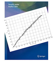
Fig. 17.2 in Intermediate Physics for Medicine and Biology.
Fig. 17.2 in Intermediate
Physics for Medicine and Biology
.
In Figure 17.2 of Intermediate Physics for Medicine and Biology, Russ Hobbie and I show a plot of all the stable nuclei. The vertical axis is the number of protons, Z (the atomic number), and the horizontal axis is the number of neutrons, N (the neutron number). The mass number A equals Z + N. Each tiny black box in the figure corresponds to a stable isotope

This figure summarizes a tremendous amount of information about nuclear physics. Unfortunately, the drawing is too small to show much detail. We must magnify part of the drawing to tell what boxes correspond to what isotopes. In this post, I provide several such magnified views.

Figure 17.2, with part of the drawing magnified.

Let’s begin by magnifying the bottom left corner, corresponding to the lightest nuclei. The most abundant isotope of hydrogen consists of a single proton. In general, an isotope is denoted using the chemical symbol with a left subscript Z and a left superscript A. The chemical symbol and atomic number are redundant, so we’ll drop the subscript. A proton is written as 1H.

The nucleus to the right of 1H is 2H, called a deuteron, consisting of one proton and one neutron. Deuterium exists in nature but is rare. The isotope 3H also exists but isn’t stable (its half life is 12 years) so it’s not included in the drawing.

The row above hydrogen is helium, with two stable isotopes: 3He and 4He. You probably know the nucleus 4He by another name; the alpha particle. As you move up to higher rows you find the elements lithium, beryllium, and  boron (10B is used for boron neutron capture therapy). Light isotopes tend to cluster around the dashed line Z = N.

Figure 17.2, with part of the drawing magnified.

Moving up and to the right brings us to essential elements for life: carbon, nitrogen, and oxygen. Certain values of Z and N, called magic numbers, lead to particularly stable nuclei: 2, 8, 20, 28, 50, 82, and 126. Oxygen is element eight, and Z = 8 is magic, so it has three stable isotopes. The isotope 16O is doubly magic (Z = 8 and N = 8) and is therefore the most abundant isotope of oxygen.

Figure 17.2, with part of the drawing magnified.

The next drawing shows the region around 40Ca, which is also doubly magic (Z = 20, N = 20). It is the heaviest isotope having Z = N. Heavier isotopes need extra neutrons to overcome the Coulomb repulsion of the protons, so the region of stable isotopes bends down as it moves right. The dashed line indicating Z = N won’t appear in later figures; it’ll be way left of the magnified region. Four stable isotopes (37Cl, 38Ar, 39K, and 40Ca) have a magic number of neutrons N = 20. Calcium, with its magic number of protons, has five stable isotopes. No stable isotopes correspond to N = 19 or 21. In general, you’ll find more stable isotopes with even values of Z and N than odd.

Figure 17.2, with part of the drawing magnified.

Next we move up to the region ranging from Z = 42 (molybdenum) to Z = 44 (ruthenium). No stable isotopes exist for Z = 43 (technetium); a blank row stretches across the region of stability. As discussed in Chapter 17 of IPMB, the unstable 99Mo decays to the metastable state 99mTc (half life = 6 hours), which plays a crucial role in medical imaging.

Figure 17.2, with part of the drawing magnified.

Tin has a magic number of protons (Z = 50), resulting in ten stable isotopes, the most of any element.

Figure 17.2, with part of the drawing magnified.

As we move to the right, the region of stability ends. The heaviest stable isotope is lead (Z = 82), which has a magic number of protons and four stable isotopes. Above that, nothing. There are unstable isotopes with long half lives; so long that they are still found on earth. Scientists used to think that an isotope of bismuth, 209Bi (Z = 83, N  = 126), was stable, but now we know its half life is 2×10¹⁹ years. Uranium (Z = 92) has two unstable isotopes with half lives similar to the age of the earth, but that’s another story.

If you want to find information about all the stable isotopes, and other isotopes that are unstable, search the web for “table of the isotopes.” Here’s my favorite: https://www-nds.iaea.org/relnsd/vcharthtml/VChartHTML.html.

Friday, January 22, 2021

Oh Happy Day!

Eric Lander
Russ Hobbie and I hope that Intermediate Physics for Medicine and Biology will inspire young scientists to study at the interface between physics and physiology, and to work at the boundary between mathematics and medicine. But what sort of job can you get with such a multidisciplinary background? How about Presidential Science Advisor and Director of the White House Office of Science and Technology Policy! This week President Biden nominated Eric Lander—mathematician and geneticist—to that important position.

Lander is no amateur in mathematics. He obtained a PhD in the field from Oxford, which he attended as a Rhodes Scholar. Later his attention turned to molecular biology and he reinvented himself as a geneticist. He received a MacArthur “genius” grant in 1987, and co-led the human genome project. Now he’ll be part of the Biden administration; the most prominent scientist to hold a cabinet-level position since biological physicist Steven Chu.

Im overjoyed that respect for science has returned to national politics. As we face critical issues, such as climate change and the covid-19 pandemic, input from scientists will be crucial. Im especially excited because not only does our new president respect science, but also—as I wrote in a letter to the editor in the Oakland Press last October—the Congressional representative from my own district, Elissa Slotkin, understands and appreciates science. During her fall campaign, I volunteered to write postcards, one of which you can read below.

The last four years have been grim, but the times they are a-changin. #Scienceisback.

Oh happy day!

Pioneer in Science: Eric Lander -- The Genesis of Genius

https://www.youtube.com/watch?v=IH4rn50arSY&lc=z13awxxhimyzinzc1231zfxwxpq1cnmqz04


Friday, January 15, 2021

Projections and Filtered Projections of a Square

Chapter 12 of Intermediate Physics for Medicine and Biology describes tomography. Russ Hobbie and I write

The reconstruction problem can be stated as follows. A function f(x,y) exists in two dimensions. Measurements are made that give projections: the integrals of f(x,y) along various lines as a function of displacement perpendicular to each line. For example, integration parallel to the y axis gives a function of x,
as shown in Fig. 12.12. The scan is repeated at many different angles θ with the x axis, giving a set of functions F(θ, x'), where x' is the distance along the axis at angle θ with the x axis.

One example in IPMB is the projection of a simple object: the circular top-hat

The projection can be calculated analytically

It’s independent of θ; it looks the same in every direction.

Let’s consider a slightly more complicated object: the square top-hat

This projection can be found using high school geometry and trigonometry (evaluating it is equivalent to finding the length of lines passing through the square at different angles). I leave the details to you. If you get stuck, email me (roth@oakland.edu) and I’ll send a picture of some squares and triangles that explains it.

The plot below shows the projections at four angles. For θ = 0° the projection is a rectangle; for θ = 45° it’s a triangle, and for intermediate angles (θ = 15° and 30°) it’s a trapezoid. Unlike the circular top-hat, the projection of the square top-hat depends on the direction.

The projections of a square top-hat, at different angles.

What I just described is the forward problem of tomography: calculating the projections from the object. As Russ and I wrote, usually the measuring device records projections, so you don’t have to calculate them. The central goal of tomography is the inverse problem: calculating the object from the projections. One way to perform such a reconstruction is a two-step procedure known as filtered back projection: first high-pass filter the projections and then back project them. In a previous post, I went through this entire procedure analytically for a circular top-hat. Today, I go through the filtering process analytically, obtaining an expression for the filtered projection of a square top-hat. 

Here we go. I warn you, theres lots of math. To perform the filtering, we first calculate the Fourier transform of the projection, CF(θ,k). Because the top-hat is even, we can use the cosine transform

where k is the spatial frequency.

Next, place the expression for F(θ,x') into the integral and evaluate it. Theres plenty of book-keeping, but the projection is either constant or linear in x', so the integrals are straightforward. I leave the details to you; if you work it out yourself, youll be delighted to find that many terms cancel, leaving the simple result 

To high-pass filter CF(θ,k), multiply it by |k|/2π to get the Fourier transform of the filtered projection CG(θ,k)

Finally, take the inverse Fourier transform to obtain the filtered projection G(θ,x'


Inserting our expression for CG(θ,k), we find

This integral is not trivial, but with some help from WolframAlpha I found

where Ci is the cosine integral. I admit, this is a complicated expression. The cosine integral goes to zero for large argument, so the upper limit vanishes. It goes to negative infinity logarithmically at zero argument. Were in luck, however, because the four cosine integrals conspire to cancel all the infinities, allowing us to obtain an analytical expression for the filtered projection

We did it! Below are plots of the filtered projections at four angles. 

The filtered projections of a square top-hat, at different angles.

The last thing to do is back project G(θ,x') to get the object f(x,y). Unfortunately, I see no hope of back-projecting this function analytically; its too complicated. If you can do it, let me know.

Why must we analyze all this math? Because solving a simple example analytically provides insight into filtered back projection. You can do tomography using canned computer code, but you won’t experience the process like you will by slogging through each step by hand. If you don’t buy that argument, then another reason for doing the math is: it’s fun!

Friday, January 8, 2021

A Portable Scanner for Magnetic Resonance Imaging of the Brain

A Portable Scanner for Magnetic Resonance Imaging of the Brain, superimposed on Intermediate Physics for Medicine and Biology.
A Portable Scanner for Magnetic
Resonance Imaging of the Brain
Cooley et al., Nat. Biomed. Eng., 2020

Chapter 18 of Intermediate Physics for Medicine and Biology describes magnetic resonance imaging. MRI machines are usually heavy, expensive devices installed in hospitals and clinics. A recent article by Clarissa Cooley and her colleagues in Nature Biomedical Engineering, however, describes a portable MRI scanner. The abstract states

Access to scanners for magnetic resonance imaging (MRI) is typically limited by cost and by infrastructure requirements. Here, we report the design and testing of a portable prototype scanner for brain MRI that uses a compact and lightweight permanent rare-earth magnet with a built-in readout field gradient. The 122-kg low-field (80 mT) magnet has a Halbach cylinder design that results in a minimal stray field and requires neither cryogenics nor external power. The built-in magnetic field gradient reduces the reliance on high-power gradient drivers, lowering the overall requirements for power and cooling, and reducing acoustic noise. Imperfections in the encoding fields are mitigated with a generalized iterative image reconstruction technique that leverages previous characterization of the field patterns. In healthy adult volunteers, the scanner can generate T1-weighted, T2-weighted and proton density-weighted brain images with a spatial resolution of 2.2 × 1.3 × 6.8 mm3. Future versions of the scanner could improve the accessibility of brain MRI at the point of care, particularly for critically ill patients.
Cooley et al.’s design has four attributes.
  1. It’s designed for imaging the head only. Most critical care MRIs are of the brain, so focusing on imaging the head is not as limiting as you might think. By restricting the device to the head they are able to reduce the weight of their prototype to 230 kg (about 500 pounds); not something you could carry in your pocket, but light enough to be transported in an ambulance or wheeled on a cart. The power required, about 1.7 kW, is far less than for a traditional MRI device, so the portable scanner can be operated from a standard wall outlet.
  2. The static magnetic field is produced by permanent magnets. Typical MRI scanners create a static field of a few Tesla using a superconductor, which must be kept cold. Cooley et al.’s device avoids cryogenics completely by using room-temperature, permanent neodymium magnets in a Halbach configuration, producing a static magnetic field of 0.08 T. The lower field strength reduces the signal-to-noise ratio, so advanced MRI techniques such as echo-planar, functional, or diffusion tensor imaging are not feasible. However, many emergency MRIs are used to diagnose traumatic brain injury and don’t rely on these more advanced techniques. The Halbach design results in a small magnetic field outside the scanner, which minimizes safety hazards associated with iron-containing objects being sucked into the scanner.
  3. The readout gradient is static. In IPMB, Russ Hobbie and I describe how magnetic field gradients are used to map the Larmor frequency to position. Usually the readout gradient of an MRI pulse sequence is turned on and off as needed. By making this gradient static, Cooley and her collaborators eliminate the need for a power supply to drive it. Most MRI pulse sequences require gradients in three directions, and in Cooley et al.’s device the gradients in the other two directions must still be switched on and off in the traditional way. One side effect of the reduced gradient switching is that this MRI scanner is quieter than a traditional device. This may seem like a minor advantage, but try having your head imaged in a typical MRI scanner with its gradient switching causing a deafening racket.
  4. Much of the signal analysis is switched from hardware to software. Because of nonlinearities in the gradient magnetic field, traditional Fourier transform algorithms to convert from spatial frequency to position produce artifacts, and iterative methods that correct for these errors are needed.
Cooley et al.’s article fascinated me because of its educational value; the challenges they face force readers to think carefully about the design parameters and limitations of traditional MRI. If you want to learn more about normal MRI scanners, read this article to see how researchers had to modify the traditional design to overcome its limitations. 

Low-cost MRI systems for brain imaging. by Clarissa Cooley.

https://www.youtube.com/watch?v=bZz3-lmWv4I

Friday, January 1, 2021

An Assessment of Illness in U.S. Government Employees and their Families at Overseas Embassies

“An Assessment of Illness in
U.S. Government Employees and
their Families at Overseas Embassies”
(2020) The National Academies Press.
Recently, a National Academies report examined the illness of staff at overseas embassies.
National Academies of Sciences, Engineering, and Medicine. 2020. “An Assessment of Illness in U.S. Government Employees and their Families at Overseas Embassies.” Washington, DC: The National Academies Press. 
The summary of the report begins
In late 2016, U.S. Embassy personnel in Havana, Cuba, began to report the development of an unusual set of symptoms and clinical signs. For some of these patients, their case began with the sudden onset of a loud noise, perceived to have directional features, and accompanied by pain in one or both ears or across a broad region of the head, and in some cases, a sensation of head pressure or vibration, dizziness, followed in some cases by tinnitus, visual problems, vertigo, and cognitive difficulties. Other personnel attached to the U.S. Consulate in Guangzhou, China, reported similar symptoms and signs to varying degrees, beginning in the following year. As of June 2020, many of these personnel continue to suffer from these and/or other health problems. Multiple hypotheses and mechanisms have been proposed to explain these clinical cases, but evidence has been lacking, no hypothesis has been proven, and the circumstances remain unclear. The Department of State (DOS), as part of its effort to inform government employees more effectively about health risks at posts abroad, ascertain potential causes of the illnesses, and determine best medical practices for screening, prevention, and treatment for both short and long-term health problems, asked the National Academies of Sciences, Engineering, and Medicine (the National Academies) to provide independent, expert guidance.
Then, under the heading of “Plausible Mechanisms,” the summary states
The committee found the unusual presentation of acute, directional or location-specific early phase signs, symptoms and observations reported by DOS employees to be consistent with the effects of directed, pulsed radio frequency (RF) energy.
I’m reluctant to disagree with a report from the National Academies. I wasn’t a member of the committee, I wasn’t consulted by them, and I haven’t analyzed the data myself. Moreover, I’m disturbed by the recent tendency of political leaders to ignore science (for example, on the Covid-19 pandemic and climate change), so I hesitate to reject a review by some of the nation’s top scientists and medical doctors. Nevertheless, I don’t find this report convincing. As I’ve written before in this blog, I’m skeptical that radio-frequency or microwave radiation can explain these effects.

The report states that
Low-level RF exposures typically deposit energy below the threshold for significant heating (often called “nonthermal” effects), while high-level RF exposures can provide enough energy for significant heating (“thermal” effects) or even burns, and for stimulation of nervous and muscle tissues (“shock” effects)... While much of the general public discussion on RF biological effects has focused on cancer, there is a growing amount of data demonstrating a variety of non-cancer effects as well, in addition to those associated with thermal heating.

The absence of certain observed phenomena can also help to constrain potential RF source characteristics. For example, the absence of reporting of a heating sensation or internal thermal damage may exclude certain types of high-level RF energy.
Microwaves affect the body if they’re strong enough to heat tissue (like in a microwave oven). But low-level radio-frequency and microwave effects are less well established (to put it politely). I don’t think there is a growing amount of reliable data demonstrating effects from RF electromagnetic radiation. The same issue arises when discussing the safety of cellular phone radiation (I fear this report will be used by some to support dubious claims of 5G hazards). The report twice cites studies by Martin Pall. As I said previously in this blog “Pall’s central hypothesis is that cell phone radiation affects calcium ion channels, which if true could trigger a cascade of biological effects…. I don’t agree with Pall’s claims.” Neither do Ken Foster and John Moulder (both cited frequently in Intermediate Physics for Medicine and Biology), who wrote that
Despite some level of public controversy and an ongoing stream of reports of highly variable quality of biological effects of RF energy... health agencies consistently conclude that there are no proven hazards from exposure to RF fields within current exposure limits.
The National Academies report emphasizes the Frey effect, in which pulsed electromagnetic radiation causes slight local heating, resulting in tiny transient changes in pressure that can be sensed by the inner ear. In a previous post, I wrote
I am no expert on thermoelastic effects, but it seems plausible that they could be responsible for the perception of sound by embassy workers in Cuba. By modifying the shape and frequency of the microwave pulses, you might even induce sounds more distinct than vague clicks. However, I don’t know how you get from little noises to brain damage and cognitive dysfunction. My brain isn’t damaged by listening to clicky sounds.
The most ridiculous paragraph in the report relates transcranial magnetic stimulation—a technique I worked on while at the National Institutes of Health—to the Frey effect.
If a Frey-like effect can be induced on central nervous system tissue responsible for space and motion information processing, it likely would induce similarly idiosyncratic responses. More general neuropsychiatric effects from electromagnetic stimuli are well-known and are being used increasingly to treat psychiatric and neurologic disorders. In 2008, the Food and DrugAdministration (FDA) approved transcranial magnetic stimulation (TMS) to treat major depression in adults who do not respond to antidepressant medications... Ten years later, the FDA approved office-based TMS as a treatment for obsessive compulsive disorder (OCD)... and portable TMS to treat migraine.

Magnetic stimulation uses large (about 1 Tesla) magnetic fields, and works at low frequencies (1–10 kHz, which are the frequencies that nerves operate at, and are well below the microwave range). Much higher frequencies are unlikely to activate nerves, and such strong magnetic fields will have tell-tale signs. For instance, one way to demonstrate the power of TMS is to place a quarter at the center of a coil and deliver a single pulse. The quarter shoots up into the air, sometimes denting a ceiling tile (I admit, this wasn’t the safest parlor trick I’ve ever witnessed). TMS only activates the brain when the coil is held within a few centimeters of the head. Trying to generate magnetic stimulation remotely would require Herculean magnetic fields that would certainly be noticed (anything metallic would start flying around and heating up). The reason the Frey effect works with weak fields is the extreme sensitivity of the human ear for detecting minuscule pressure oscillations. If the authors of the report think citing transcranial magnetic stimulation is appropriate as evidence to support the plausibility of a Frey-like effect, then they don’t understand the basic physics of how electric and magnetic fields interact with the body.

My view is much closer to that expressed in the article “Havana Syndrome Skepticism” by Robert Bartholomew, which was published in eSkeptic, the email newsletter of the Skeptics Society.

The Frey effect is named after Allan Frey, a pioneer in radiation research. But there are many problems with the explanation. It is highly speculative, and none of the panel members appeared to be experts on the biological impact of microwaves and the Frey effect. Someone who is a specialist on the effect, University of Pennsylvania bioengineer Kenneth Foster, is critical of the report, observing that there is no evidence that the Frey effect can cause injuries. Furthermore, the effect requires a tremendous amount of energy to create a sound that is barely audible... Foster should know, in 1974, he and Edward Finch were the first scientists to describe the mechanism involved in the effect while working at the Naval Medical Research Institute in Maryland...

Foster views any link between his eponymous effect and Havana Syndrome as pure fantasy. “It is just a totally incredible explanation for what happened to these diplomats…. It’s just not possible. The idea that someone could beam huge amounts of microwave energy at people and not have it be obvious defies credibility...” The former head of the Electromagnetics division of the Environmental Protection Agency, Ric Tell, also views the microwave link as science fiction. Tell spent decades working on standards for safe exposure to electromagnetic radiation, including microwaves. “If a guy is standing in front of a high-powered radio antenna — and it’s got to be high, really high — then he could experience his body getting warmer,” Tell said. “But to cause brain-tissue damage, you would have to impart enough energy to heat it up to the point where it’s cooking. I don’t know how you could do that, especially if you were trying to transmit through a wall. It’s just not plausible,” he said.
At the risk of sounding like a grumpy old curmudgeon, I don’t believe the National Academies report. I don’t agree that directed radio-frequency or microwave energy is the most likely explanation for the “Havana Syndrome.” I don’t have a better explanation, but I don’t accept theirs. It’s not consistent with what we know about how electromagnetic fields interact with biological tissue.

Friday, December 25, 2020

The Mathematical Approach to Physiological Problems

In Chapter 2 of Intermediate Physics for Medicine and Biology, Russ Hobbie and I analyze decay with multiple half-lives, and practice fitting data to exponentials. Near the end of this discussion, we write (really, Russ wrote these words, since they go back to his solo first edition of IPMB)
Estimating the parameters [governing exponential decay] for the longest-lived term may be difficult because of the potentially large error bars associated with the data for small values of y. For a discussion of this problem, see Riggs (1970, pp. 146–163).

The Mathematical Approach of Physiological Problems, by Douglas S. Riggs, superimposed on Intermediate Physics for Medicine and Biology.
The Mathematical Approach
to Physiological Problems
,
by Douglas S. Riggs.
The citation is to the book The Mathematical Approach to Physiological Problems, by Douglas Riggs. I  wanted to take a look, so I went to the Oakland University library and checked out the 1963 first edition.

It’s a gold mine. I particularly like the beginning of the preface. Riggs starts with what seems like an odd digression about hiking in the mountains, but then in the second paragraph he skillfully brings us back to math.

Before settling down in the village of Shepreth, in Cambridgeshire, England, to start working in earnest upon this book, I had the unusual pleasure of taking my family on a month-long youth hosteling trip through Northern England and the Scottish Highlands. For the most part, we bicycled, but occasionally we would make an excursion on foot up the steep hillsides and along the rocky ridges where no bicycle could go. We soon learned that the British discriminate carefully between “hill walking” and “mountain climbing.” To be a mountain climber, you must coil 100 feet of nylon rope around you slantwise from shoulder to waist, and have a few pitons dangling somewhere about. You are then entitled to adopt an ever-so-faintly condescending attitude toward any hill-walkers whom you may encounter along the trail, even if you meet them where the trail is practically level. Hill-walkers, on the other hand, remain hill-walkers even when the “walk” turns into a hands-and-knees job up a 40° slope of talus which is barely anchored to the mountain by a few wisps of grass and a clump or two of scraggly heather.

Mathematically speaking, this is a hill-walking book. It is necessarily so, since I myself have never learned the ropes of higher mathematics. But I do believe that the amount of wandering I have done on the lower slopes, the number of sorry hours I have spent lost in a mathematical fog, and the miles I have stumbled down false trails have made me a kind of backwoods expert on mathematical pitfalls, and have given me some practical knowledge of how to plan a safe mathematical ascent of the more accessible physiological hills.
One theme I stress in this blog is the value of simple models. Riggs agrees.
Precisely because living systems are so very complex, one can never expect to achieve anything like a complete mathematical description of their behavior. Before the mathematical analysis itself is begun, it is therefore invariably necessary to reduce the complexity of the real system by making various simplifying assumptions about how it behaves. In effect, these assumptions allow us to replace the actual biological system by an imaginary model system which is simple enough to be described mathematically. The results of our mathematical analysis will then be rigorously applicable to the model. But they will be applicable to the original biological system only to the extent that our underlying assumptions are reasonable. Hence, the ultimate value of our mathematical labors will be determined in large part by our choice of simplifying assumptions.
He then advocates for an approach that I call “think before you calculation.”
An investigator who publishes an erroneous equation has no place to hide! It is therefore prudent to check each calculation, each algebraic manipulation, and each transcription from a table of figures before going on to the next step. Above all, whenever you are engaged in mathematical work you should keep asking yourself over and over and over again, “Does this make sense?” and “Is this of the correct magnitude?
Riggs’s introduction ends with some wise advice.
All too frequently, students are willing to accept on faith whatever mathematical formulations they encounter in their reading. And why not? After all, mathematics is the exact science, and presumably an author would not express his theories or his conclusions mathematically without due regard for mathematical rigor and precision. It is only by bitter experience that we learn never to trust a published mathematical statement or equation, particularly in a biological publication, unless we ourselves have checked it to see whether or not it makes sense… Misprints are common. Copying errors are common. Blunders are common. Editors rarely have the time or training to check mathematical derivations. The author may be ignorant of mathematical laws, or he may use ambiguous notation. His basic premises may be fallacious even though he uses impressive mathematical expressions to formulate his conclusions… Caveat lector! Let the reader beware!
What about the problem of fitting multiple exponentials to data, which is why Russ and I cite Riggs in the first place? After analyzing several specific examples, Riggs concludes
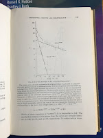
Page 157 of The Mathematical Approach to Physiological Problems, showing a fit to a double exponential, superimposed on Intermediate Physics for Medicine and Biology.
Page 157 of The Mathematical
Approach to Physiological Problems
,
showing a fit to a double exponential.
These examples warn us not to take too seriously any particular set of coefficients and rate constants which we may get by plotting data on semi-logarithmic paper and ferreting out the exponential terms in the fashion described above. The need for such a warning is all too evident from the preposterously elaborate exponential equations which are sometimes published. The technique of “peeling off” successive terms is so deceptively easy! Fit a straight line, subtract, plot the differences, fit another straight line, subtract, plot the differences. How solid and impressive the resulting sum of exponentials looks! And how remarkably well the curve agrees with the observations. Surely the investigator can be pardoned a certain self-satisfaction for having so clearly identified the individual components which were contributing to the overall change. Yet, the examples discussed above show how groundless his satisfaction may be. It is undoubtedly true that the particular sum of exponentials which he happened to pick, plot, and publish fits the points with gratifying accuracy. But so also may other equations of the same general form but with quite different parameters. It is not great trick to have found one such equation. Even with a single exponential declining from a known value at time zero toward an unknown constant asymptote there are two parameters—the rate constant and the asymptote—to be fitted to the data. The effect of a considerable change in either may be largely offset by making a compensatory change in the other… Add a second exponential term with two more parameters to be estimated from the data, and the number and variety of “closely fitting” equations becomes truly bewildering. Worst of all, there are no simple statistical measures of the precision with which any of the parameters have been estimated. These considerations do not destroy the value of fitting an exponential equation to experimental data when it is suggested by some underlying theory or when it provides a convenient empirical way of summarizing a group of observations mathematically… But they make very clear the danger of using an empirical exponential equation to predict what may happen beyond the period actually covered by the observations. It is equally clear that we must be exceedingly skeptical when attempts are made to match the individual terms of an empirical exponential equation with supposedly corresponding processes or regions of the body.
Riggs’s book examines many of the same topics that appear in the first half of IPMB, such as exponential growth, diffusion, and feedback. He has a wonderful chapter suggesting questions you should ask when checking the validity of an equation. Is it dimensionally correct? How does it behave when variables approach zero or infinity? Does it give reasonable answers after numerical substitution?

I’m impressed that Riggs, a professor and head of a Department of Pharmacology at SUNY Buffalo, could write so insightfully about mathematics. I give the book two thumbs up.