I always love top ten lists, so I prepared a list of my top ten illustrations in
Intermediate Physics for Medicine and Biology. These are a subjective, personal selections; you may prefer others. I excluded any figure that was reproduced in
IPMB from another publication, so many of my favorite images are not listed. Except as noted,
Russ Hobbie created these figures, and they appeared first in earlier editions of
IPMB on which he was sole author.
10.
Figure 15.30. Although this figure is not the most attractive of those in the top ten, I selected it because it is based on Russ’s simulation program MacDose. Be sure to watch
Russ’s video based on MacDose; it is a great learning experience.
9.
Figure 7.13. I helped create this figure when I was in graduate school. Russ asked my PhD advisor
John Wikswo if he could supply two figures showing the extracellular potential (Fig. 7.13) and magnetic field (Fig. 8.14) produced by an axon. Wikswo asked me to do the calculations, and he had an illustrator in the lab produce the final drawing.
8.
Figure 17.19. This
scintillation camera bone scan of a 7-year-old boy is spooky, with ghostly radioactive hot spots. It is one of the many medical images Russ obtained from colleagues at the
University of Minnesota. In this case, Bruce Hallelquist provided the photo.
IPMB is much the richer for all the images provided by Russ’s friends.
7.
Figure 15.15. This figures illustrates the transfer of energy between photons and electrons. I like how it summarizes much of the chapter about the Interaction of Photons and Charged Particles with Matter in a single drawing.
6.
Figure 14.24. New in the 4th edition of
IPMB, this figure illustrates the
blackbody radiation spectrum. It clarifies why the spectrum appears different when plotted versus frequency compared to when plotted versus wavelength.
5.
Figure 12.12. This illustration defining the projection is critical to understanding
tomography. Russ and I liked it so much that we considered using it on the cover of the 4th edition of
IPMB, until Springer decided to go with their own cover design that didn’t include a figure from the book.
4.
Figure 16.23. This image, obtained using
digital subtraction angiography, is another medical illustration provided by one of Russ’s colleagues at the University of Minnesota (Richard Geise). I chose it because it is stunningly beautiful.
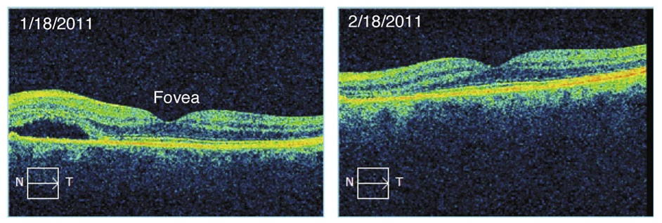
3.
Figure 14.16. Color! This optical coherence tomogram of the retina was supplied by Kirk Morgan. A few figures in
IPMB go beyond black and white, but this is the only one in glorious full color.
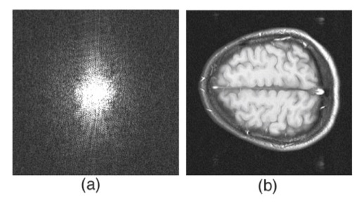
2.
Figure 12.6. I like this
magnetic resonance image of the brain because it helps build insight into how an image and its
Fourier transform are related. It is the first of a series of six images in Chapter 12 prepared by Tuong Huu Le (University of Minnesota, also thanks to Xiaoping Hu) that, by themselves, provide a short course in image processing.
And the winner is….
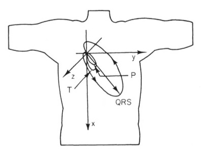
1.
Figure 7.16. This picture of the direction of the dipole during the cardiac cycle nicely summarizes the
electrocardiogram. My career has focused on the bioelectric behavior of the heart, so it is fitting that my top pick builds on that theme. The reason I chose it, however, is because it was on the cover of the first edition of
IPMB, which I used in my first medical physics course taught by John Wikswo at
Vanderbilt University.