Friday, May 5, 2017

Magnetic Force Microscopy for Nanoparticle Characterization

In Chapter 8 of Intermediate Physics for Medicine and Biology, Russ Hobbie and I discuss biomagnetism. The 5th edition of IPMB contains a brief new section on magnetic nanoparticles
8.8.4 Magnetic Nanoparticles

Small single-domain nanoparticles (10–70 nm in diameter) are used to treat cancer (Jordan et al. 1999; Pankhurst et al. 2009). The particles are injected into the body intravenously. Then an oscillating magnetic field is applied. It causes the particles to rotate, heating the surrounding tissue. Cancer cells are particularly sensitive to damage by hyperthermia. Often the surface of the nanoparticles can be coated with antibodies that cause the nanoparticle to be selectively taken up by the tumor, providing more localized heating of the cancer.
Suppose you wanted to image the distribution of nanoparticles in tissue. How would you do it? In IPMB we describe several ways to map magnetic field distributions, including using a superconducting quantum interference device (SQUID) magnetometer. Is there a way to get even better spatial resolution than using a SQUID? Gustavo Cordova, Brenda Yasie Lee, and Zoya Leonenko recently published a review in the NanoWorld Journal describing “Magnetic Force Microscopy for Nanoparticle Characterization” (Volume 2, Pages 10–14, 2016). Their abstract states
Since the invention of the atomic force microscope (AFM) in 1986, there has been a drive to apply this scanning probe technique or a form of this technique to various disciplines in nanoscale science. Magnetic force microscopy (MFM) is a member of a growing family of scanning probe methods and has been widely used for the study of magnetic materials. In MFM a magnetic probe is used to raster-scan the surface of the sample, of which its magnetic field interacts with the magnetic tip to offer insight into its magnetic properties. This review will focus on the use of MFM in relation to nanoparticle characterization, including superparamagnetic iron oxide nanoparticles, covering MFM imaging in air and in liquid environments.
Figure 1 from their paper shows how the MFM “two-pass technique” works: a first scan produces a topographical image using an atomic force microscope, and then a second pass creates a magnetic image using a magnetic force microscope. Both the AFM and MFM are based on using a small, nanometer sized scanning tip attached to a cantilever to detect small-scale tip deflections.


Their Figure 2 shows the results of MFM imaging of superparamagnetic iron oxide nanoparticles (SPIONs). The technique has sufficient sensitivity that they can measure how the size distribution of SPIONs depends on the particle coating.


Cordova et al. conclude
Considering rapid development of novel applications of magnetic nanoparticles in medicine and biomedical nanotechnology, as therapeutic agents, contrast agents in MRI imaging and drug delivery [3] MFM characterization of nanoparticles becomes more valuable and desirable. Overall, MFM has proven itself to be an effective yet underused tool that offers great potential for the localization and characterization of magnetic nanoparticles.
The magnetic force microscope does not have the exquisite picotesla sensitivity and millisecond time resolution of a SQUID, and it requires access to the tissue surface so you can scan over it. But for static, strong-field systems such as magnetic nanoparticle distributions, the magnetic force microscope provides exceptional spatial resolution, and represents one more tool in the physicists arsenal for imaging magnetic fields in biology.

Friday, April 28, 2017

The Thermodynamics of the Proton Spin

In Intermediate Physics for Medicine and Biology, Russ Hobbie and I introduce a lot of statistical mechanics and thermodynamics. For instance, in Chapter 3 we describe the Boltzmann factor and the heat capacity, and in Chapter 18 we analyze magnetic resonance imaging by considering the magnetization of the two-state spin system using statistical mechanics. Perhaps we can do a little more.

First, let’s calculate the average energy of a spin-1/2 proton in a magnetic field B. The proton has two states: up and down. Up has the lower energy Eup = -μB, and down has the higher energy Edown = +μB, where μ is the proton’s magnetic moment. Using the Boltzmann factor, the probability of having spin up is Pup = C eμB/kT, and of spin down is Pdown = C e-μB/kT, where T is the absolute temperature and k is Boltzmann’s constant. The spin must be in one of these two states, so Pup + Pdown = 1, or C = 1/(eμB/kT + e-μB/kT). The average energy,E⟩, is PupEup + PdownEdown, or

An equation giving the average energy of spins in a magnetic field B at a temperature T.
The total energy E of the spin system is just the average energy times the number of spins, E = NE.

Equations are not just things you plug numbers into to get other numbers. Equations tell a physical story. So, whenever I teach the two-state spin system I stress the story, which becomes clearer if we examine the limiting cases of this equation. At high temperatures (μB much less than kT), the argument of the hyperbolic tangent is small, we can use a Taylor expansion for the exponentials, and the average energy is –μ2B2/kT. This is the limit of interest for magnetic resonance imaging, when the average energy increases as the square of the magnetic field. At low temperatures (μB much greater than kT), the argument of the hyperbolic tangent is large, tanh goes to one, and the average energy is –μB. All the spins are in the spin up ground state.

Next, let’s calculate the heat capacity, C = dE/dT. The derivative of the hyperbolic tangent is the hyperbolic secant squared, so

An equation for the heat capacity of spins in a magnetic field B at temperature T.
The leading factor is the number of molecules time the Boltzmann constant, which is equal to the number of moles times the gas constant. At high temperatures, C goes to zero because of the leading factor of 1/T2. Physically, this result arises because in this case the spins are approximately half spin up and half spin down, so the average energy is about zero, and making the system even hotter won’t change the situation. You typically see this type of behavior in systems that have an upper energy level (as opposed to, say, a system like the harmonic oscillator that has energy levels at increasing energies without bound). At low temperatures, C also goes to zero because the secant goes to zero at large argument. This result arises because the spin down state freezes out: if the system is cold enough no spins can reach the spin down state so the average energy is simply the energy of the spin up ground state.

The heat capacity going to zero as the temperature goes to zero is one way of stating the third law of thermodynamics. Russ and I discuss the first and second laws of thermodynamics in IPMB, but not the third. This is mainly because life occurs at warm temperatures, so the behavior as T approaches absolute zero does not have much biological significance. But although little biology happens around absolute zero, much physics does. To learn more about the world at low temperatures, I recommend the book The Quest for Absolute Zero, by Kurt Mendelssohn. Fascinating reading.

Friday, April 21, 2017

Erythropoietin and Feedback Loops

In Chapter 10 of Intermediate Physics for Medicine and Biology, Russ Hobbie and I discuss feedback loops. We included two new problems about feedback loops in the 5th edition of IPMB, but as Russ says “you can never have too many examples.” So, here’s another.

The number of red blood cells is controlled by a feedback loop involving the hormone erythropoietin. The higher the erythropoietin concentration, the more red blood cells are produced and therefore the higher the hematocrit. However, the kidney adjusts the production of erythropoietin in response to hypoxia (caused in part by too few red blood cells). The lower the hematocrit the more erythropoietin produced. This new homework problem illustrates the feedback loop. It reinforces concepts from Chapter 10 on feedback and from Chapter 2 on the exponential function, and requires the student to analyze data (albeit made-up data) rather than merely manipulating equations. Warning: the physiological details of this feedback loop are more complicated than discussed in this idealized example.
Section 10.3

Problem 17 ½. Consider a negative feedback loop relating the concentration of red blood cells (the hematocrit, or HCT) to the concentration of the hormone erythropoietin (EPO). In an initial experiment, we infuse blood or plasma intravenously as needed to maintain a constant hematocrit, and measure the EPO concentration. The resulting data are

HCT EPO
(%) (mU/ml)
20 200
30   60.1
40   18.1
50     5.45
60     1.64

In a healthy person, the kidney adjusts the concentration of EPO in response to the oxygen concentration (controlled primarily by the hematocrit). In a second experiment, we suppress the kidney’s ability to produce EPO, control the concentration of EPO by infusing the drug intravenously, and measure the resulting hematocrit. We find

EPO HCT
(mU/ml) (%)
  1 35.0
  2 36.0
  5 39.1
10 45.0
20 59.5

(a) Plot these results on semilog paper and determine an exponential equation describing each set of data.
(b) Draw a block diagram of the feedback loop, including accurate plots of the two relationships.
(c) Determine the set point (you may have to do this numerically).
(d) Calculate the open loop gain.
Biochemist Eugene Goldwasser first reported purification of erythropoietin when working at the University of Chicago in 1977. In his essay “Erythropoietin: A Somewhat Personal History” he writes about his ultimately successful attempt to isolate erythropoietin from urine samples.
Unfortunately the amounts of active urine concentrates available to us from the NIH source or our own collection were still too small to make significant progress, and it seemed as if purification and characterization of human epo might never be accomplished—that it might remain merely an intriguing biological curiosity. The prospect brightened considerably when Drs. M. Kawakita and T. Miyake instituted a very large-scale collection of urine from patients with aplastic anemia in Kumamato City, Japan. After some lengthy correspondence, Dr. Miyake arrived in Chicago on Christmas Day of 1975, carrying a package representing 2550 liters of urine [!] which he had concentrated using our first-step procedure. He and Charles Kung and I then proceeded systematically to work out a reliable purification method…we eventually obtained about 8 mg of pure human urinary epo .
You can learn more about Goldwasser and his career in his many obituaries, for instance here  and here. A more wide-ranging history of erythropoietin can be found here.

Friday, April 14, 2017

Unequal Anisotropy Ratios

In Chapter 7 of Intermediate Physics for Medicine and Biology, Russ Hobbie and I discuss the bidomain model, a mathematical description of the anisotropic electrical properties of cardiac tissue.
Anisotropy plays an important role in the bidomain model. To see why, consider a solution to Laplace’s equation in a monodomain—a two-dimensional sheet of homogeneous, anisotropic tissue with straight fibers. If the x direction is chosen to be along the fiber direction (the direction of greatest conductivity), then Laplace’s equation becomes
 Now define a new set of coordinates
and
 You can show that in these new coordinates Laplace’s equation becomes
We have removed the effect of anisotropy by rescaling distance in the direction perpendicular to the fibers. If you try a similar trick with the bidomain model … you can find a new coordinate system that removes the effect of anisotropy in either the intracellular space or the extracellular space, but in general you cannot find a coordinate system that removes the anisotropy in both spaces simultaneously (Roth 1992).
My 1992 paper (Journal of Mathematical Biology, Volume 30, Pages 633–646) contains one of my favorite figures, which illustrates the importance of bidomain anisotropy visually. It is equivalent to an old concept from mechanics called the simultaneous diagonalization of two quadratic forms.

A liiustration explaining unequal anisotropy ratios using the simultaneous diagonalization of two quadratic forms.

Russ and I continue,
Only in the special case of equal anisotropy ratios (σix/σiy = σox/σoy ) will the equations simplify dramatically. But the anisotropy ratios in the heart are not equal. In the intracellular space the ratio of conductivities parallel and perpendicular to the fibers is about 10:1, while in the extracellular space this ratio is about 4:1 (Roth 1997). Anisotropy plays an essential role in the electrical behavior of the heart, especially during electrical stimulation.
My 1997 paper (IEEE Transactions on Biomedical Engineering, Volume 44, Pages 326–328), published 20 years ago this month, contains an estimate of the bidomain conductivities. After surveying much of the available experimental data, I found
  • Intracellular Longitudinal Conductivity     σiL     0.2 S/m 
  • Intracellular Transverse Conductivity        σiT     0.02 S/m
  • Extracellular Longitudinal Conductivity    σeL    0.2 S/m 
  • Extracellular Transverse Conductivity       σeT    0.08 S/m
This means that the ratio of the conductivity along the fibers to the conductivity across the fibers is 10:1 in the intracellular space, while only 5:2 in the extracellular space.

Hold on. In IPMB, Russ and I said σeLeT = 4:1, but now I am saying σeLeT = 5:2. Drat! IPMB is wrong. Another entry for the errata

The 1997 paper is highly cited: Google Scholar lists 178 citations. This perplexes me, because I have many papers that are more significant and innovative, but have far fewer citations. I guess usefulness can sometimes be as important as significance and innovation.

Friday, April 7, 2017

Radiopaedia

A screenshot of Radiopaedia.org.
Readers of Intermediate Physics for Medicine and Biology learn topics in medical physics from a physics point-of-view. Often, however, the discussion in IPMB doesn’t emphasize clinical applications. Where can you get more clinical information? Radiopaedia! Radiopaedia.org is a free online website with a large collection of radiology cases and reference articles.

To see what this site is like, I typed some terms into its search box. When I searched for MRI, I found articles about topics that Russ Hobbie and I present in Chapter 18 of IPMB, such as MRI pulse sequences and MRI artifacts, but also a wealth of clinical topics such as protocols for MRI brain screens, stroke, demyelination, and rectal cancer. The site also contains many case studies of specific patients. And it doesn’t cost a thing.

Radiopaedia has much information about nuclear medicine (Chapter 17 in IPMB). I typed “99mTc” into the search box and found articles describing a variety of radiopharmaceuticals based on the technetium-99m radioisotope. Also, the site has much information about positron emission tomography (PET) and single photon emission computed tomography (SPECT).

Radiopaedia covers the interaction of x-rays with tissue (Chapter 15 in IPMB) in a variety of articles about different mechanisms such as the photoelectric effect, Compton scattering, and pair-production. Many features of x-ray technology are also discussed (Chapter 16 in IPMB), like x-ray tubes, filters, collimators, grids, and intensifying screens. But also describes x-ray images of specific body parts, such as the abdomen, pelvis, ankle, and shoulder. And all this information is available gratis.

The web site discusses computed tomography qualitatively, but not quantitatively, and lacks much of the mathematics presented in Chapter 12 of IPMB. It contains many medical images, but almost no other figures. For example, the discussion of four generations of CT scanners would benefit from a figure, like Fig. 16.25 in IPMB.

Ultrasound is covered in Chapter 13 of IPMB, and also in Radiopaedia. Topics include transducers, pulse-echo imaging, elastography, and Doppler imaging. Best of all, this valuable information is on the house.

One of the best parts of Radiopaedia is the quiz mode for patient cases. You get to be the doctor, analyzing different medical problems. These cases are too difficult for me to diagnose, but perhaps you can. I find Radiopaedia to be a helpful, no-cost supplement to our book: IPMB supplies the math and physics, while Radiopaedia analyzes the clinical applications.

Did I mention that Radiopaedia is free?

Enjoy.

Friday, March 31, 2017

Top Ten Illustrations in Intermediate Physics for Medicine and Biology

I always love top ten lists, so I prepared a list of my top ten illustrations in Intermediate Physics for Medicine and Biology. These are a subjective, personal selections; you may prefer others. I excluded any figure that was reproduced in IPMB from another publication, so many of my favorite images are not listed. Except as noted, Russ Hobbie created these figures, and they appeared first in earlier editions of IPMB on which he was sole author.

A figure from Intermediate Physics for Medicine and Biology showing how radiation interacts with tissue using the program MacDose.

10. Figure 15.30. Although this figure is not the most attractive of those in the top ten, I selected it because it is based on Russ’s simulation program MacDose. Be sure to watch Russ’s video based on MacDose; it is a great learning experience.

A figure from Intermediate Physics for Medicine and Biology showing the extracellular potential produced by a nerve axon.
9. Figure 7.13. I helped create this figure when I was in graduate school. Russ asked my PhD advisor John Wikswo if he could supply two figures showing the extracellular potential (Fig. 7.13) and magnetic field (Fig. 8.14) produced by an axon. Wikswo asked me to do the calculations, and he had an illustrator in the lab produce the final drawing.

A figure from Intermediate Physics for Medicine and Biology showing a bone scan obtained using a scintillation camera.
8. Figure 17.19.  This scintillation camera bone scan of a 7-year-old boy is spooky, with ghostly radioactive hot spots. It is one of the many medical images Russ obtained from colleagues at the University of Minnesota. In this case, Bruce Hallelquist provided the photo. IPMB is much the richer for all the images provided by Russ’s friends.

A figure from Intermediate Physics for Medicine and Biology showing how radiation and electrons interact in biological tissue.

7. Figure 15.15. This figures illustrates the transfer of energy between photons and electrons. I like how it summarizes much of the chapter about the Interaction of Photons and Charged Particles with Matter in a single drawing.

A figure from Intermediate Physics for Medicine and Biology showing how blackbody radiatio depends on both frequency and wavelength.
6. Figure 14.24. New in the 4th edition of IPMB, this figure illustrates the blackbody radiation spectrum. It clarifies why the spectrum appears different when plotted versus frequency compared to when plotted versus wavelength.

A figure from Intermediate Physics for Medicine and Biology showing how tomography works.
5. Figure 12.12. This illustration defining the projection is critical to understanding tomography. Russ and I liked it so much that we considered using it on the cover of the 4th edition of IPMB, until Springer decided to go with their own cover design that didn’t include a figure from the book.

A figure from Intermediate Physics for Medicine and Biology showing a digital subtraction angiography.

4. Figure 16.23. This image, obtained using digital subtraction angiography, is another medical illustration provided by one of Russ’s colleagues at the University of Minnesota (Richard Geise). I chose it because it is stunningly beautiful.

A figure from Intermediate Physics for Medicine and Biology showing an image obtained using optical coherance tomography.

3. Figure 14.16. Color! This optical coherence tomogram of the retina was supplied by Kirk Morgan. A few figures in IPMB go beyond black and white, but this is the only one in glorious full color.

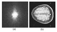
A figure from Intermediate Physics for Medicine and Biology showing an image of the brain and its Fourier transform.
2. Figure 12.6. I like this magnetic resonance image of the brain because it helps build insight into how an image and its Fourier transform are related. It is the first of a series of six images in Chapter 12 prepared by Tuong Huu Le (University of Minnesota, also thanks to Xiaoping Hu) that, by themselves, provide a short course in image processing.

And the winner is….

A figure from Intermediate Physics for Medicine and Biology showing the behavior of the electrocardiogram.
1. Figure 7.16. This picture of the direction of the dipole during the cardiac cycle nicely summarizes the electrocardiogram. My career has focused on the bioelectric behavior of the heart, so it is fitting that my top pick builds on that theme. The reason I chose it, however, is because it was on the cover of the first edition of IPMB, which I used in my first medical physics course taught by John Wikswo at Vanderbilt University.

A photograph of the cover of the first edition of Intermediate Physics for Medicine and Biology.

Friday, March 24, 2017

Enhancement of Human Color Vision by Breaking the Binocular Redundancy

Russ Hobbie and I added a discussion of color vision to the 5th edition of Intermediate Physics for Medicine and Biology.
The eye can detect color because there are three types of cones in the retina, each of which responds to a different wavelength of light (trichromate vision): red, green, and blue, the primary colors. However, the response curve for each type of cone is broad, and there is overlap between them (particularly the green and red cones). The eye responds to yellow light by activating both the red and green cones. Exactly the same response occurs if the eye sees a mixture of red and green light. Thus, we can say that red plus green equals yellow. Similarly, the color cyan corresponds to activation of both the green and blue cones, caused either by a monochromatic beam of cyan light or a mixture of green and blue light. The eye perceives the color magenta when the red and blue cones are activated but the green is not. Interestingly, no single wavelength of light can do this, so there is no such thing as a monochromatic beam of magenta light; it can only be produced my mixing red and blue. Mixing all three colors, red and green and blue, gives white light.
I know that some animals have dichromate vision (only two color receptors), as do some color blind people. Also, a few animals have tetrachromate vision (four color receptors). But I never imagined that I could have enhanced color vision just by wearing a pair of fancy glasses. Could I become a tetrachromat?

Yes! A preprint appeared recently in the biological physics arXiv by Mikhail Kats and his colleagues at the University of Wisconsin about “Enhancement of Human Color Vision by Breaking the Binocular Redundancy” (arXiv:1703.04392). Graduate student and National Science Foundation Graduate Research Fellow Brad Gundlach is the lead author of this fascinating paper. The abstract is given below.
To see color, the human visual system combines the responses of three types of cone cells in the retina—a process that discards a significant amount of spectral information. We present an approach that can enhance human color vision by breaking the inherent redundancy in binocular vision, providing different spectral content to each eye. Using a psychophysical color model and thin-film optimization, we designed a wearable passive multispectral device that uses two distinct transmission filters, one for each eye, to enhance the user’s ability to perceive spectral information. We fabricated and tested a design that “splits” the response of the short-wavelength cone of individuals with typical trichromatic vision, effectively simulating the presence of four distinct cone types between the two eyes (“tetrachromacy”). Users of this device were able to differentiate metamers (distinct spectra that resolve to the same perceived color in typical observers) without apparent adverse effects to vision. The increase in the number of effective cones from the typical three reduces the number of possible metamers that can be encountered, enhancing the ability to discriminate objects based on their emission, reflection, or transmission spectra. This technique represents a significant enhancement of the spectral perception of typical humans, and may have applications ranging from camouflage detection and anti-counterfeiting to art and data visualization.
I’d love to try out a pair of these glasses! I wonder whether they provide merely a subtle change in vision or offer an entirely new visual experience? Also, what would it be like to have each eye receiving different color information? Does the brain need to be trained to handle the additional information, or does it adapt easily? If the enhancement of vision is dramatic, I could easily see these glasses becoming the hot new gadget people clamor for this Christmas. And it all comes from applying physics to medicine and biology.

Friday, March 17, 2017

Five Popular Misconceptions about Osmosis

In Chapter 5 of Intermediate Physics for Medicine and Biology, Russ Hobbie and I discuss osmotic pressure.
5.2 Osmotic Pressure in an Ideal Gas

The selective permeability of a membrane gives rise to some striking effects. The flow of water that occurs because solutes are present that cannot get through the membrane is called osmosis. This phenomenon seems strange when it is first encountered, and explanations are often fraught with misconceptions (Kramer and Myers 2012).
What are these misconceptions that explanations are often fraught with? The reference is to the paper “Five Popular Misconceptions About Osmosis” (American Journal of Physics, Volume 80, Pages 694–699, 2012). The paper raises five questions.
  1. Is osmosis limited to mixtures in the liquid state? 
  2. Does osmosis require an attractive interaction between solute and solvent? 
  3. Can osmosis drive solvent from a compartment of lower to higher solvent concentration? 
  4. Can the osmotic pressure be interpreted as the partial pressure of the solute? 
  5. What exerts the force that drives solvent across the semipermeable membrane, overcoming both viscous resistance and an opposing hydrostatic pressure gradient?
Later in the paper, the authors answer these questions.
  1. The phenomenology of osmosis is the same for gases, liquids, and supercritical fluids. The misconception is that osmosis is limited to liquids. 
  2. Osmosis does not depend on an attractive force between solute and solvent. The misconception is that osmosis requires an attractive force. 
  3. Osmosis can drive solvent from a lower to a higher solvent concentration compartment. The misconception is that osmosis always happens down a concentration gradient. 
  4. The osmotic pressure cannot be interpreted as the partial pressure of the solute. The misconception is that it can. 
  5. The semipermeable membrane exerts the force that drives solvent flow. The misconception is that no force is required to explain the flow.
So, how did Russ and I do?
  1. We certainly get the first question correct, because our initial explanation is for an ideal gas. 
  2. I think we get the second one right too, but it is not as clear, because we restrict our discussion to ideal solutions in which no heat is evolved or absorbed. 
  3. We cast our discussion in terms of the chemical potential, and then relate the chemical potential to the hydrostatic pressure and the solute concentration. I don’t think we ever address the issue of solvent concentration. I’ll say we are silent on this one. 
  4. We say “Except in an ideal gas, it [the chemical potential] is not the same as the partial pressure (a concept that is not normally used in a liquid).” So we get this one right, and I’m glad we put the not in italics. 
  5. In Section 5.9.6 we have a nice discussion about the forces acting on the membrane. But we never really say what force explains the solvent flow. Again, I’ll say we are silent on this one.
Kramer and Myers have an illuminating discussion about the force causing the solvent to cross the membrane (I’ve removed all their references; you can find them in the original paper).
Consider an idealized semipermeable membrane as a force field that repels solute but has no effect on the solvent. The Brownian motion of the solute molecules bring them into occasional contact with this field, at which time they receive some momentum directed away from the membrane. Viscous interactions between solute and solvent then rapidly distribute this momentum to the solvent molecules in the neighborhood of the membrane. In this way, the membrane exerts a repulsive force on the solution as a whole. Since additional pure solvent can freely cross our idealized membrane, it flows into the solution compartment, gradually increasing the hydrostatic pressure in the solution. Thus, a pressure gradient builds up across the thickness of the membrane. This pressure gradient exerts a second force on the solution, capable of counteracting the membrane force. Quantitative treatments show that the pressure difference required to stop solvent flow into a dilute solution is exactly Π = kBTcB. Nelson has aptly called the mechanism by which the membrane drives fluid flow the rectification of Brownian motion.
Overall I would say Russ and I do okay. We don’t propagate any of the five misconceptions. We answer three of their questions correctly and are silent on two others. Most of the discussion about osmosis goes back to the 3rd or earlier editions of IPMB, so Russ is the one who got it right. At least I didn’t screw it up.

Friday, March 10, 2017

My Honors College Class: The Making of the Atomic Bomb

The Making of the Atomic Bomb, by Richard Rhodes, superimposed on Intermediate Physics for Medicine and Biology.
The Making of the Atomic Bomb,
by Richard Rhodes.
This semester I am teaching a class in Oakland University’s Honors College called “The Making of the Atomic Bomb,” based on Richard Rhodes’s book by the same name. The class is a mixture of nuclear physics, a history of the Manhattan Project, and a discussion about World War II (today we discuss Pearl Harbor). I became interested in this topic from the writings of Cameron Reed of Alma College here in Michigan.

The Honors College students are outstanding, but they are from disciplines throughout the university and do not necessarily have strong math and science backgrounds. Therefore the mathematics in this class is minimal, but nevertheless we do a two or three quantitative examples. For instance, Chadwick’s discovery of the neutron in 1932 was based on conclusions drawn from collisions of particles, and relies primarily on conservation of energy and momentum. When we analyze Chadwick’s experiment in my Honors College class, we consider the head-on collision of two particles of mass M1 and M2. Before the collision, the incoming particle M1 has kinetic energy T and the target particle M2 is at rest. After the collision, M1 has kinetic energy T1 and M2 has kinetic energy T2.

Intermediate Physics for Medicine and Biology examines an identical situation in Section 15.11 on Charged-Particle Stopping Power.
The maximum possible energy transfer Wmax can be calculated using conservation of energy and momentum. For a collision of a projectile of mass M1 and kinetic energy T with a target particle of mass M2 which is initially at rest, a nonrelativistic calculation gives
One important skill I teach my Honors College students is how to extract a physical story from a mathematical expression. One way to begin is to introduce some dimensionless parameters. Let t be the ratio of kinetic energy picked up by M2 after the collision to the incoming kinetic energy T, so t = T2/T or, using the notation in IPMB, t = Wmax/T (the subscript “max” arises because this maximum value of T2 corresponds to a head-on collision; a glancing blow will result in a smaller T2). Also, let m be the ratio of M1 to M2, so m = M1/M2. A little algebra results in the simpler-looking equation
The goal is to unmask the physical behavior hidden in this equation. The best way to proceed is to examine limiting cases. There are three that are of particular interest.

m much less than 1. When m is small (think of a fast-moving proton colliding with a stationary lead nucleus) the denominator is approximately one, so t = 4m. Because m is small, so is t. This means the proton merely bounces back elastically as if striking a brick wall. Little energy is transferred to the lead nucleus.
An illustration showing how a light mass behaves when it hits a stationary heavy mass.
 m much greater than 1. When m is large (think of a fast-moving lead nucleus smashing into a stationary proton) the denominator is approximately m2, so t = 4/m. Because m is large, t is small. This means the lead continues on as if the proton were not even there, with little loss of energy. The proton flies off at a high speed, but because of its small mass it carries off negligible energy.
An illustration showing how a heavy mass behaves when it hits a stationary light mass.
m equal to 1. When m is one (think of a neutron colliding with a proton, which was the situation examined by Chadwick), the denominator becomes 4, and t = 1. All of the energy of the neutron is transferred to the proton. The neutron stops and the proton flies off at the same speed the neutron flew in.
An illustration showing how a mass behaves when it hits a stationary mass.
A mantra I emphasize to my students is that equations are not just things you put numbers into to get other numbers. Equations tell a physical story. Being able to extract this story from an equation is one of the most important abilities a student must learn. Never pass up a chance to reinforce this skill.

Friday, March 3, 2017

Glucose, Mannitol, Sucrose, and Raffinose

The structure of glucose.
You would think by now I would know everything in Introductory Physics for Medicine and Biology; after all, I’m one of the authors. So when thumbing through the book the other day (doesn’t everyone thumb through IPMB when they have a spare moment?) I came across Figure 4.11, showing a log-log plot of the diffusion constant as a function of molecular radius. Four data points stand out—glucose, mannitol, sucrose, and raffinose—because they are plotted as open rather than solid circles. This figure was drawn originally by Russ Hobbie and has appeared in every edition of IPMB. I got to wondering “why did Russ choose to plot those four molecules out of the thousands available?” And then, more specifically, I found myself asking “just what is raffinose anyways?”

Figure 4.11 of Intermediate Physics for Medicine and Biology, showing the diffusion constant of a molecule as a function of the size of the molecule.

To figure all this out, I grabbed the textbook I read in graduate school while auditing the biochemistry class taken by Vanderbilt medical students (Biochemistry, by the late Geoffrey Zubay). These molecules are carbohydrates or, more simply, sugars. Glucose is the canonical example; this six-carbon molecule C6H12O6 is “the single most important substrate for energy metabolism” and in humans it is “the single most important sugar in the blood”. It usually exists in a ring conformation. It is a monosaccharide because it consists of a single ring. Other monosaccharides are fructose and galactose, which all have the same formula, C6H12O6, but the arrangement of the atoms is slightly different.

Mannitol differs from glucose by having an extra two hydrogen atoms: C6H14O6. Technically it’s a sugar alcohol rather than a sugar. You’d think it would act similarly to glucose, but it doesn’t. Mannitol is relatively inert in humans. It doesn’t cross the blood-brain barrier (I discussed the implications of this previously in this blog) and it is not reabsorbed by the kidney like glucose is so it acts as an osmotic diuretic. In Fig. 4.11, the mannitol and glucose data almost overlap, and it is hard to tell which data point is which. According to a paper by Bashkatov et al. (2003), glucose has a larger diffusion coefficient than mannitol, so glucose must be the data point above and to the left, and mannitol below and to the right.

Sucrose is a disaccharide, which means it is two monosaccharides bound together through a “glycosidic linkage”. It’s common table sugar, and consists of a molecule of glucose bound to a molecule of fructose. Russ probably chose to plot sucrose as a typical disaccharide. Two other  disaccharides he could have chosen are lactose (glucose + galactose) and maltose (glucose + glucose).

Raffinose is a trisaccharide, consisting of galactose + glucose + fructose. Therefore, Russ’s choice of plotting glucose, sucrose, and raffinose makes sense: the most important monosaccharide, disaccharide, and trisaccharide. A fun fact about raffinose is that the human digestive tract does not have the enzyme needed to digest it. However, certain gas-producing bacteria in our gut can digest it, resulting in flatulence. You probably won’t be surprised to learn that beans often contain a lot of raffinose.

So, Russ is a clever fellow. He hid a short review of carbohydrate biochemistry in Fig. 4.11. Who knew?